Posts

.21 - Magazine Cover Editorial terms and definitions

Image
  Masthead:  the title of a newspaper or magazine at the head of the front or editorial page.   Tagline: a  slogan or short text that serves to clarify a thought for the magazine.  Skyline: the information panel on the cover that tells the reader about other stories in the magazine. Pug/Puffs: usually located on the corner or the side of the cover used to promote something or incentives the reader. Main Cover Line: A headline on the front cover advertising a story or feature inside the magazine Main Image: Usually placed in the middle of the front page would be the most important or appeal most to the readers. Secondary Images: Other less important images placed in the cover to show other stories or features within the magazine Frames: Used to differentiate magazine from others and also used to emphasize subjects within the frame.
.20 - Editing Terms and Definitions

      editing terms and definition: Continuity editing Systems: This is a style of editing the requires the director to make the film recreate what the audiences reality is. The dominant convention in mainstream film and television. Noncontinuity editing systems: When shots are mismatched to disrupt the impression of time and space. Disturbs the illusion of reality Shot/ Reverse Shot: where one character is shown looking at another character than the other character is shown looking back at the first character. Eyeline match: are where actors look while acting in a scene. Its a film editing technique to indicate to the audience what a character is seeing. Looking through the characters eyes. Graphic Match: Is and extremely powerful transitional device . An idea is conveyed with a single cut. Action Match: Cutting or action or matching on action refers to film editing and video editing techniques where the editor cuts from one shot t...

.19 - Preliminary Task: Double Page Spread Explanation

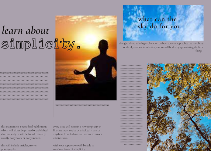
The double page spread allowed me to put forth and interpret I wanted readers to get from reading my magazine. I continued with the same aesthetic i set forth the previous two pages having the same simplicity and font. This just being a rough draft and being used as a practice for my future magazines. I am happy with how my magazine looks but i would most likely not stay with this concept for the magazine.

.18 - Preliminary Task: Double Page Spread

Image

.17 - Preliminary task: Table of Contents Explanation

I continued with the simple and minimalist look onto the table of contents. Having the image of the purplish sky fits well into the page and fills up needed space in the page. In the table of contents I presented the 3 sections that would be in the magazine.

.16 - Preliminary Task: Table of Contents

Image
 

.15 - Preliminary Task: Magazine Cover Explanation

 The magazine I was going for in this preliminary task was a mentally healing and refreshing magazine. The masthead I wanted to be simple to match with the minimalist theme I was going for. I wanted the masthead to be noticeable but not stand out over the main image of the sky that I wanted to emphasize. I wanted to include the short text about the magazine so the reader knows what they are going to read about but i did not want it to overlap with the image of the sky. I put the main theme of the whole magazine in the middle where it is readable but does not overpower the image of the sky. I wanted the background color of the magazine to not overpower the color of the sky but i did not want a dark color so i ended up with a lilac color.